VR introduction video
With the aim of serving as an introduction to the project and as a prelude to virtual reality in which the
results of the good design criteria are shown visually and interactively, we created a video of just
under a minute long, with a more artistic approach than any other product developed for this research.
The video was conceived for viewing both in a traditional static format and in 360º.
Why in 360° ?
The video was made in 360º for various reasons, one of them was to try to adapt the project to the current tastes of the audience, whose video consumption is highly relevant, especially from mobile devices —smartphone and tablet— through networks social.
On the other hand, this format is more immersive and that was one of the main objectives: to make the user feel that they are entering a world of good design, hence its title, Good design.
What images appear in the video ?
The video was proposed from the beginning to serve as a presentation of the project and as an entrance to virtual reality, being able to be viewed directly from a computer or mobile device or through the use of VR glasses to improve the experience, making it more immersive and interactive. For this reason, the idea arose of creating a kind of time tunnel in which small details inspired or extracted from well-known posters or pictorial works made by great poster artists and graphic designers and from other images and graphic resources, such as typefaces that have been especially relevant in the history of design in general and in the creation of posters in particular.
In the video you can see in order of appearance, the female figure of the lithographic poster «F. Champenois» in Art Nouveau style by Alphonse Mucha made in 1898 (Victoria and Albert Museum [V&A], 2020), the Helvetica fonts created by the Swiss Max Miedinger in 1957 after a commission to renovate the Akzidenz Grotesk y la Futura, created by Paul Renner in 1927. On the other hand, the constructivist poster «Beat the Whites with the Red Wedge», made by El Lissitzky in 1919, a poster of the Braun company from the year 2014, the transatlantic ship of the iconic «Normandie» poster made by Cassandre in 1935, a jacketed character taken from one of the posters made by Manolo Prieto in 1944 for Danone, which is combined by means of an animation with the eye of the famous «Eye-Bee-M» poster from the IBM company designed by Paul Rand in 1981, passing through a series of effects to the renowned logo slogan of Milton Glaser «I Love New York», uses made for the first time in 1977. Later on you can see a series of details taken from a Bauhaus pictorial work and an adaptation made for this work of a poster recently designed by Marty Geller in the style of the previously named school. Finally, the video ends with a detail of the poster for the film Vertigo by Alfred Hitchcock, made by Saul Bass in 1958, symbolizing the end of this sensitive tunnel that leads to the universe or world of good design.
The interest in using these well-known images was made both to attract the attention of the viewer, arousing their curiosity through this series of details included in the animation and so that from the beginning the viewer could consume good graphic examples, since, as has dealt with throughout this research, the ability to detect graphic quality can be obtained after the visual consumption of good examples.
Why artistic and sensitive ?
This digitally created time tunnel tries to make the spectator experience that he is advancing – thanks to the images shown – feeling that he is going to another place. The main idea was to envelop the viewer through virtual reality and immerse him in a world in which through images and music he lost his consciousness and could move and enter another place totally different from his own, being in this case, to “the history of good design”. Exactly the viewer is transferred to a place inspired by the German Pavilion in Barcelona, which was adapted for
this work, with the aim of displaying a series of animated posters showing the keys that a poster must meet to be considered a good design, an interactive game and information of interest related to the topic of this research.
Museum / universe of good design in virtual reality
Another of the exercises developed with the students of the Université Savoie Mont Blanc was the creation of a virtual reality space that could contain some data and examples extracted from this research. Through the use of virtual reality, the objective was to make the user feel all kinds of new sensations, to be absorbed, lose consciousness of the real world and get them to feel interest and interact with what is shown in this custom modified space . Through this exercise, people are not only mere spectators, but also become active participants.
Why the German Pavilion?
At first it was thought of creating a white room as a museum, but finally it was decided to use a digital replica of the German Pavilion in Barcelona. With modern aesthetics, the German Pavilion was designed by Ludwig Mies van der Rohe and Lilly Reich for the 1929 Barcelona International Exposition. It was dismantled a year later, but thanks to “the significance and recognition of the Pavilion” (Fundació Mies van der Rohe Barcelona) was rebuilt between 1983 and 1986 on the same site and with the same materials as the first time. This building has become a key reference both in the trajectory of the famous architect and in the architectural history of the 20th century.
Thanks to the originality in the use of the pavilion’s materials – a structure of steel, glass and polished stone, emblematic of the Modern Movement – it is capable of expressing the ideal of modernity through the rigor of its geometry, the precision of its pieces and the clarity of their assembly (miesbcn.com). This building, apart from providing a historical interest to the work, allows, thanks to the extraordinary simplicity of its structure, to add content to its interior without diverting attention or interfering with the message, while providing a pleasant feeling that invites you to enjoy the space. and to discover it calmly.
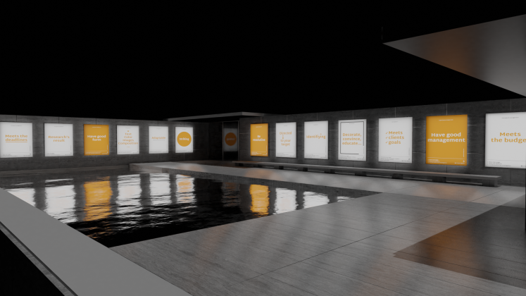
What content is inside the VR?
What content is inside the VR?
In virtual reality, 21 posters can be seen —with the concepts of good design— displayed on the walls of the outer area of the Pavilion. On the other hand, in an indoor area, 22 phrases of good design are reproduced on another wall, -especially from the poster-, by renowned designers and researchers throughout history that have been used throughout the memory of this research and finally, on another wall, an interactive game is projected in which to put into practice the concepts learned after having made the tour of the Pavilion.
1. Exhibition within virtual reality of the 21 posters on the criteria of good poster design
2. Quotes about good design that are reproduced on one of the walls of the Pavilion created in virtual reality
3. Virtual reality game located on one of the walls of the Pavilion created in virtual reality
In the game, to put into practice the knowledge acquired about the poster, the user is asked to select the best option between two posters. For this activity, 14 posters were created that are displayed two by two. Each pair of posters talks about the same topic and once one of them is selected -with the joystick that the user has-, a green or red icon appears below each poster depending on the solution and a small phrase that justifies the result.
For the time being, virtual reality has been used to present the results of the research, though using it as a method of research in future work has also been suggested.
Special thanks to Thomas Pactole, Tom Abed and Lucas Leigneil for their collaboration in the realization of virtual reality for this project.
You can find more information about this project by accessing the website goodposterdesign.com or by writing to the author Noa Real García at her email address: hello@noareal.com